Harmony with
Human, Nature, Technology
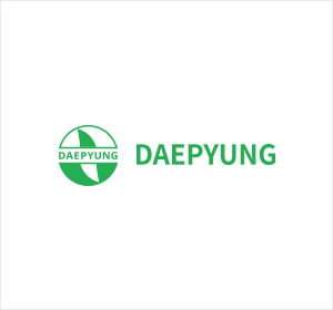
About our CI
Daepyung pursues the balance of people, nature, and technology.
Corporate Identity
Corporate Identity
Daepyung is committed to the harmony of cutting-edge technology and rich nature.
The large circle in Daepyung’s corporate identity symbolizes a bowl made by the harmony of nature and cutting-edge technology,
like the balance of Yin and Yang.
The leaf inside it symbolizes life and abundance, and further represents a peaceful world.
Space requirements
A minimal amount of protective space is necessary around the symbol mark and the word mark to maintain the structural characteristics of the corporate identity.
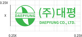
Space requirement B can be applied
if it is difficult to assure readability due to space
constraints in outdoor media in which readability is important.
Assuming that the height of the logo mark is X,
the minimum space of 0.25X should be secured around the logo.
Color
DAEPYUNG
GREEN
- Pantone Color : 361C
- Process Color : C75 / M0 / Y100 / K0
- RGB Color : R57 / G181 / B74
Signature
The signatures were created intentionally to present unification and form the identity by combining the symbol mark and word type systematically and effectively.
The one that best suits the medium can be selected and used.
-
Korean
-
English
-
Application